assalamu alaykum
[imgleft]http://sphotos.ak.fbcdn.net/photos-ak-snc1/v370/26/76/45712352811/n45712352811_1630659_8046.jpg[/imgleft]Hey brothers and sisters, hermanos y hermanas.
Help us with the design of Turntoislam. I am going to be making some changes soon, and time has come to also make a re-design. So, rather than just making it, its important also to have you involved too.
Deadline: Friday 20th August.
(the thread might stay open beyond that date, but the sooner u can send us ur ideas the better, inshaAllah)
You can help us by making a new logo, it can be any colour, or design you wish. But, remember the site colour scheme will be determined by the logo as well.. so this is keep this in mind please.
However, the Logo should be:
* unique
* Scalable something we can use in different formats, i.e. on the website and also easily used on a leaflet or poster, newsletter etc
* TTI Uses the Letters TTI
* Rememerable
additional things that the logo may reflect, not 100% necessary, but cool are:
* showing the nature of our family atmosphere/community
* that we correct misconceptions
* (authenticity) that we love the Quran and Sunnah.
Some of those things can be reflected in the way the text is written.
When I ask think of a logo or a brand? You will automatically think of Nike, Adidas, McDonalds even. Their logos are simple and easily remembered. We need something similar with TTI.
Please do not use this current website design as an example, be free to express your ideas however you want.
Post your ideas here. You can upload your file as an attachment.
Its not necessary that you make your picture using computer. Perhaps you have ideas, but, you are not very good at graphic design, thats Okay.") Just draw it by hand, and Scan it, or photograph it, and upload as an attachment. Everyone is welcome to participate, dont worry, it does not have to look "amazing", just have a go ! its fun, and its something we are doing so that we have a better way of communicating the message of Islam, to a wider audience.
Just draw it by hand, and Scan it, or photograph it, and upload as an attachment. Everyone is welcome to participate, dont worry, it does not have to look "amazing", just have a go ! its fun, and its something we are doing so that we have a better way of communicating the message of Islam, to a wider audience.
and inshaAllah its a beginning of a new era for TTI too. We will go on to do a lot more things together. bi'iznillah.
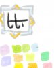
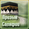
Classic TTI logo (used at the start) :

I designed this when I first made TTI, it was kinda rushed, but I wanted keep it simple. I think its nice, can do with some re-working. Maybe you like it, maybe you dont! Whatever the case, feel free to change it around. Perhaps its better to just have TTI written underneath and the text turntoislam written in more legible writing to the side.
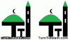
and ..

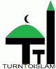
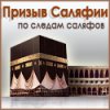
This is more of a banner, its not really a logo. A logo, is more like the thing u see to the left, the orange mosque. -Orange mosques, are cool
Maybe your design is completely different, thats Okay.
But keep it simple, and also make it recognisable for our logo.
Here is another example of a design, i was thinking of the Islamic patterns. But, I dunno, its kinda common to see these kind of designs....

Squiggly Colour blobs... are just colour blobs.. dont ask!! but, i was just thinking what are nice pastel shaded colours!!
So, what best expresses TurntoIslam ? in a logo?? Have a go, inshaAllah.
(p.s please keep the replies limited to this topic, dont ask questions about any features for TTI or anything else, or when the website will be ready, this is just a topic about the logo and its design. )
Jazak Allahu khayr
Assalamu alaykum wa rahmatullahi wa barakatuh
[imgleft]http://sphotos.ak.fbcdn.net/photos-ak-snc1/v370/26/76/45712352811/n45712352811_1630659_8046.jpg[/imgleft]Hey brothers and sisters, hermanos y hermanas.
Help us with the design of Turntoislam. I am going to be making some changes soon, and time has come to also make a re-design. So, rather than just making it, its important also to have you involved too.
Deadline: Friday 20th August.
(the thread might stay open beyond that date, but the sooner u can send us ur ideas the better, inshaAllah)
You can help us by making a new logo, it can be any colour, or design you wish. But, remember the site colour scheme will be determined by the logo as well.. so this is keep this in mind please.
However, the Logo should be:
* unique
* Scalable something we can use in different formats, i.e. on the website and also easily used on a leaflet or poster, newsletter etc
* TTI Uses the Letters TTI
* Rememerable
additional things that the logo may reflect, not 100% necessary, but cool are:
* showing the nature of our family atmosphere/community
* that we correct misconceptions
* (authenticity) that we love the Quran and Sunnah.
Some of those things can be reflected in the way the text is written.
When I ask think of a logo or a brand? You will automatically think of Nike, Adidas, McDonalds even. Their logos are simple and easily remembered. We need something similar with TTI.
Please do not use this current website design as an example, be free to express your ideas however you want.
Post your ideas here. You can upload your file as an attachment.
Its not necessary that you make your picture using computer. Perhaps you have ideas, but, you are not very good at graphic design, thats Okay.
Just draw it by hand, and Scan it, or photograph it, and upload as an attachment. Everyone is welcome to participate, dont worry, it does not have to look "amazing", just have a go ! its fun, and its something we are doing so that we have a better way of communicating the message of Islam, to a wider audience. and inshaAllah its a beginning of a new era for TTI too. We will go on to do a lot more things together. bi'iznillah.
Classic TTI logo (used at the start) :
I designed this when I first made TTI,
it was kinda rushed, but I wanted keep it simple. I think its nice, can do with some re-working. Maybe you like it, maybe you dont! Whatever the case, feel free to change it around. Perhaps its better to just have TTI written underneath and the text turntoislam written in more legible writing to the side.and ..
This is more of a banner, its not really a logo. A logo, is more like the thing u see to the left, the orange mosque. -Orange mosques, are cool
Maybe your design is completely different, thats Okay.
But keep it simple, and also make it recognisable for our logo.
Here is another example of a design, i was thinking of the Islamic patterns. But, I dunno, its kinda common to see these kind of designs....
Squiggly Colour blobs... are just colour blobs.. dont ask!! but, i was just thinking what are nice pastel shaded colours!!
So, what best expresses TurntoIslam ? in a logo?? Have a go, inshaAllah.
(p.s please keep the replies limited to this topic, dont ask questions about any features for TTI or anything else, or when the website will be ready, this is just a topic about the logo and its design. )
Jazak Allahu khayr
Assalamu alaykum wa rahmatullahi wa barakatuh